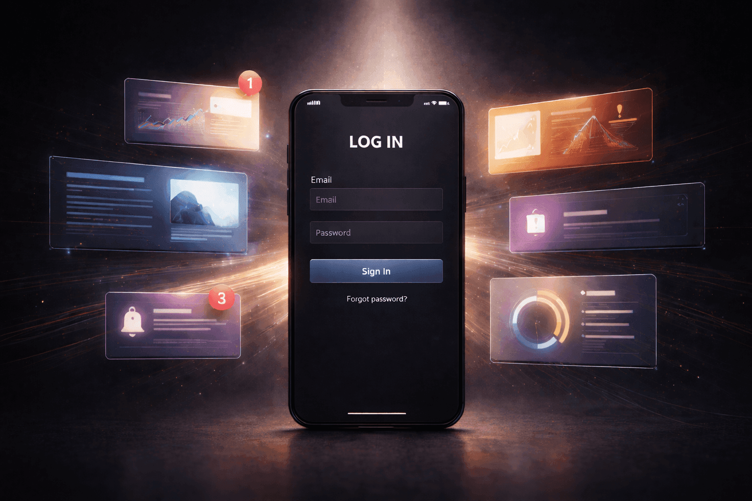
How Design Shapes Trust in Jackpot Monitors

A slot jackpot monitor can lose trust before anyone even questions the number itself. Usually it starts with the screen around it. The value is hard to scan, the label barely explains the pool, and the update behavior feels a little too polished to believe. You see the same split on pages like HelpSlotWin, where the display only works if the number reads like information instead of decoration.
Some pages get this wrong by leaning too hard on spectacle. Big glow. Constant movement. Tiny context text buried under styling. The result looks active, sure, but once someone tries to read it like actual product information, the weak parts show up fast.
Why Number Clarity Comes First
If the number is the main thing on screen, it should be easy to read on the first pass. Sounds obvious. A lot of displays still make that harder than it needs to be.
Sometimes the type is huge but cramped. Sometimes the commas barely separate the digits. Sometimes the font treatment makes the amount look ornamental instead of readable. Most users are not going to say the typography is bad. They just pause for a second longer than they should, and that pause is enough to make the display feel less solid.
A cleaner interface gets the small details under control. Strong separators. Predictable spacing. Enough contrast that the total stands apart from the background instead of buzzing against it. If people have to check the number twice just to feel sure they read it right, the design is already working against itself.
What Makes a Jackpot Meter Feel Believable
Believability usually comes from restraint. A good jackpot meter does not sit there looking dead, but it also does not move like it is trying to win a performance contest.
The useful version gives clear signs the value is updating without turning every change into a show. Maybe the amount shifts in uneven steps. Maybe there is a light refresh cue. Maybe the movement matches the pace of the rest of the screen instead of acting like a separate reality. That kind of behavior feels grounded.
The weaker version goes too hard. The total climbs in perfect dramatic motion. The screen keeps animating even when everything else is quiet. The meter starts looking choreographed. Once that happens, people stop reading it as data and start reading it as interface theater.
Where Shared Pool Labels Fail

A lot of trust problems start here. The number is visible. The context is not.
Users need to know what kind of total they are looking at. One game. Shared pool. Networked jackpot. Local amount. If that label is tiny, vague, or pushed into some decorative corner, the screen leaves too much work to the person reading it. Now they have to guess what is feeding the total, and once that starts, trust gets thin fast.
This is one of the easiest ways a display undercuts itself. The amount gets the loudest voice on the page, then the one bit of text that explains the amount is treated like an afterthought. It looks fine at a glance. The weakness only shows up once somebody actually tries to understand what the number represents.
How Hierarchy Directs Attention
Good hierarchy saves users from sorting the screen out by hand. They should read the amount first, then the pool label, then whatever explains update state or scope. That order should feel natural as soon as the page loads.
A weak layout scrambles that. Background effects hit harder than the number. Decorative elements pull more attention than the label. Other counters sit nearby with almost the same visual weight, so the eye has to decide what deserves attention first. The page starts feeling busy before anyone could explain why.
You can see this in smaller placement choices too. A pool label tucked too far away from the total feels disconnected. A refresh note sitting under unrelated cards reads like footer noise instead of part of the meter. Even a strong slot jackpot monitor loses force when the supporting information feels stranded somewhere else on the page.
Users feel that friction even if they never name it. They bounce between the amount and the label, then recheck the whole thing because the first read did not feel reliable.
When Refresh Behavior Feels Off

People notice refresh weirdness more than designers sometimes think. Not in technical language, but in instinct. The number pauses too long. Then it jumps too far. Or it keeps moving while the rest of the page sits completely still. Something about it feels detached.
Refresh rhythm tells users whether the meter belongs to the system around it. If the page is mostly calm, the display should not feel like it is running on pure showmanship. If the page is live and reactive, the number should not lag in a way that makes it seem stale.
There is also the timing right after a refresh. Sometimes the new value appears before the surrounding label settles. Sometimes the total changes but the update cue arrives a beat later, which makes the sequence feel fake. Those little timing misses are easy to miss in reviews and very easy to feel in actual use.
A lot of credibility gets lost here in small ways. Not because one update is wrong, but because the rhythm feels decorative instead of functional. Once that feeling sets in, people keep looking at the number without really accepting it.
Why the Meter Should Support, Not Distract
Some pages treat the display like the whole point of the screen. More glow. More motion. More emphasis. Bigger number. It grabs attention for a second, sure. Then it starts wearing the page out.
A stronger design lets the meter do its job without turning it into the only thing that exists. The number is clear. The label is readable. The refresh behavior makes sense. The rest of the page still has room to breathe. That balance keeps the display useful instead of exhausting.
A louder display does not automatically feel more premium. Most of the time it just feels less disciplined. Once the meter starts overpowering everything around it, users stop trusting it as information and start seeing it as pressure.
Where Trust Starts to Slip
Trust rarely breaks all at once. Usually it starts with one small doubt, then another. The value is a little hard to parse. The pool label is vague. The updates feel too polished. The hierarchy makes the screen harder to read than it should be. None of those things has to be huge on its own.
After a while the meter stops feeling dependable and starts feeling staged. That shift is subtle, but once it happens, the interface has a hard time winning the user back.
People do not trust a jackpot display because it looks expensive or dramatic. They trust it when the number is clear, the label says enough, the movement feels tied to something real, and the screen helps them read the display in the right order. If the interface cannot do that, the page keeps asking for belief without giving enough back, so you end up looking at it without really buying it.