

How Mobile Login Readability Affects User Trust
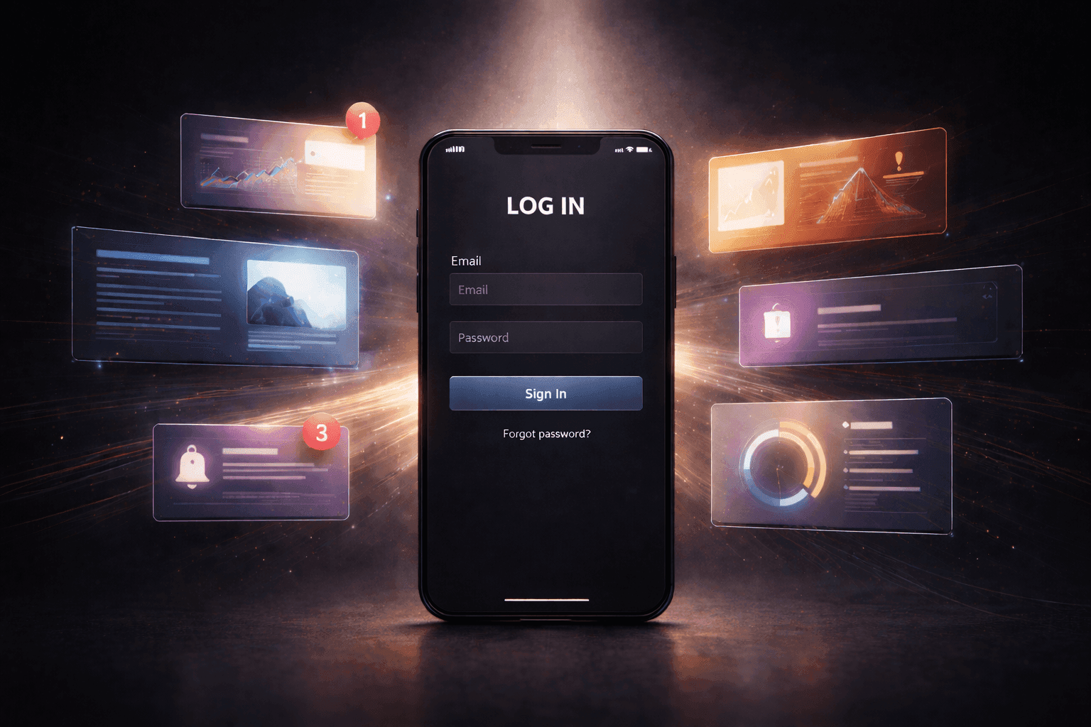
You can tell pretty quickly when a mobile login page is awkward to use. The keyboard comes up and part of the form is hidden. The label is there, but faint enough that you check it twice. The password field sits lower than expected, so now you are shifting the screen around for something that should have taken no effort at all. Nothing has failed, but the page already feels less trustworthy than it should.
That shift starts early on mobile. Before anyone reaches the account page, they are already deciding whether the login feels clear or irritating. A faint label, a cramped field, or a layout that moves too much once the keyboard opens can put people on edge right away.

What the First Screen Tells the User
The first screen does more than show a login box. It tells the user what the page wants them to do first and what the page thinks deserves the most attention. When that visual order is off, the whole screen feels slightly wrong before the user even taps anything.
A lot of weak login pages make the same mistake here. The banner at the top gets the strongest treatment. A sign-up block looks cleaner than the sign-in form. Sometimes the install route is easier to notice than the browser login. The form is still on the page, but it no longer feels like the page’s main job.
You can run into the same issue on a JL16 login page when the browser route is present but not clearly leading the screen. On mobile, that kind of hesitation shows up fast. There is less room, less patience, and less tolerance for figuring out what should have been obvious from the start.
Why Login Form Clarity Shrinks on Mobile
A form can look fine in a design review and still feel annoying on an actual phone. Labels that seemed subtle on a larger screen start looking washed out. Fields that felt roomy no longer do once the keyboard is up and the lower part of the screen gets crowded. Some forms still lean too hard on placeholder text, which looks tidy until the user taps into the field and the prompt disappears.
The bigger problem is how the form behaves once the screen gets busy. A submit button can drop too low. A floating label can get harder to read once typing starts. An error message can appear far enough from the field that caused it that the user has to stop and work out what went wrong. Even autofill or a password manager prompt can make a tight layout feel more cramped than it already was.
Field order adds to that. When the first thing in view is not the first thing the user actually needs, the form starts creating extra work. The page may still function, but it stops feeling direct.
That is why login form clarity changes so much on mobile. The issue is not just whether the fields exist. It is whether the screen still feels easy to follow once the keyboard opens, the layout shifts, and the user is doing all of this with one hand.

When Browser and App Paths Start Competing
A browser login page does not need much to work well. It just needs to feel complete on its own. Problems start when the page quietly treats the browser route like the lesser option.
You see it when the app prompt gets stronger contrast than the sign-in form, or when the browser path starts looking like a fallback instead of a normal way in. The user came to log in, but the page is already nudging them toward another decision. Install the app. Open the app. Try that route instead.
You can see the same tension on pages tied to JL16 app when the browser form is technically there but visually treated like the backup route. Once that happens, the browser experience starts feeling provisional. It is still available, but it no longer feels fully backed by the layout.
How Readability Starts Breaking Trust
Trust usually drops through small moments, not one big failure. The label is readable, but only if the user pauses. The active field does not stand out enough. The password toggle is there, but cramped into the edge of the input. The user taps submit and the feedback is so weak that they are not sure whether anything happened.
Those details change how people use the page. They slow down. They double-check. They tap more carefully than they should have to. A routine sign-in starts feeling slightly awkward, and that is enough to change the tone of the whole experience.
People are not judging that screen on its own. They are coming to it after using other mobile apps that already feel easy to navigate. Banking apps, email apps, delivery apps, messaging apps. So when a login page feels noisy or uncertain, the difference is obvious right away.

What Good Mobile Login UX Feels Like
A good mobile login page feels uneventful in the best way. The form is clearly the main thing on screen. The labels still make sense once typing starts. The keyboard comes up without turning the layout into a moving target. If something goes wrong, the message is easy to spot and clearly tied to the right field. If there is also an app option, it stays in the background unless the user wants it.
That is usually enough. People should be able to sign in without decoding the layout, rechecking labels, or wondering whether the browser route is only there as a backup. On mobile, those details shape the page long before the user gets past the login.


